
|
Brian Sims
Editor |
| Home> | Fire | >Evacuation | >Emergency Evacuation: ‘Green to be Seen’ |
Emergency Evacuation: ‘Green to be Seen’
02 May 2025
GREEN IS a colour we all see every day. It has multiple uses and is synonymous with nature, calmness, clean energy, sustainability and conservation. Considered by many as the universal colour of safety and ‘go’, we’re even told that green improves focus and is good for us. In the UK at least, legislation dictates that emergency exit signage (ie the ‘running man’ legend) is white on green. Alan Ward examines precisely why.

We speak of light, but what, exactly, is it? The electromagnetic spectrum ranges from radio waves, with comparatively long wavelengths (measured in metres), through to gamma rays with relatively short wavelengths (at 1x10⁻¹⁰ metres or picometres).
As electromagnetic radiation, light comprises a very small part of this spectrum (broadly residing in the middle between infrared and ultraviolet) and is typically referred to as the visible spectrum or visible light (ie what can be perceived by the human eye and what we actually see). It’s the main thing we use to perceive the world around us. Without it we would, quite literally, find ourselves in the dark.
When light hits an object, some of it is absorbed and some reflected. The reflected light is what we see and perceive as the colour of the object upon which our eyes are fixed. The actual colour depends on the wavelength of the reflected light and how we perceive it.
While there’s an infinite number of visible colours, Sir Isaac Newton discovered that white light consists of seven primary colours (ie red, orange, yellow, green, blue, indigo and violet), which is in keeping with Aristotle’s seven classes of colour. These are not to be confused with what we understand as ‘primary colours’. That’s a discussion for another time.
Newton also demonstrated that each colour in the spectrum is monochromatic, meaning that each consists of a single and unique wavelength that cannot be split into further colours.
Human perception
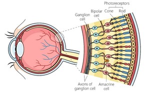
Humans are trichromats, as well as having stereo vision, meaning that we see in 3D and perceive three primary colours: blue, green and red. The retina (ie the light-sensitive layer of tissue at the back of the human eye) incorporates specialised cells, rods and cones, which react to different wavelengths or colours. When light hits them, these receptors convert light stimuli or images into signals.
The transmission of these electrical signals containing the vision information from each eye travels to the brain via our optic nerves. The information is processed in stages, ultimately reaching the visual cortices of the cerebrum and telling our brain what objects and colours we’re seeing.
Each colour has a different energy level and wavelength. The retina can detect light between wavelengths of 400 nanometres (ie blue) through to 700 nanometres (ie red), which is the visible spectrum. Green sits somewhere in the middle at circa 555 nanometres. This is where our visual perception is at its greatest, in turn meaning that green is the colour we see best.
Contrast vision
Another element that’s crucial for the effective perception of the world around us is contrast. Technically, contrast vision is our ability to differentiate between shades of grey. However, in the real-world environment, contrast is affected by the difference in brightness (ie luminance), tone and colour between an object and its background or environment. In essence, reduced contrast impacts our ability to see things distinctly.
Without a significant and perceivable difference, the brain cannot distinguish between the two, thus the object becomes ‘camouflaged’ and impossible to see. This is particularly true for those individuals with compromised vision or colour blindness or when someone’s attempting to visualise in lower light environments.
Motion also helps our visual acuity and perception. It segments an object against its background, meaning that we notice a moving object much more easily than a stationary one and even predict the direction of travel. Our ability to recognise movement, particularly so relative to our movement whether we track it or not, sounds simple to achieve. We understand what it enables us to do and why it’s useful, but even now, we’re not totally clear on how.
Good contrast enhances readability, both in close-up and at a distance, reduces eye strain and increases safety as a direct result. Similarly, motion improves our ability to perceive the object.
Human reaction and understanding
In days gone by, it’s believed that the ability to perceive green was of significant competitive advantage to primates. The human species, which emerged in the forests and savannas of Africa 300,000 years ago, had a close biological relationship with the colour green and its meaning, which has been a factor for our evolutionary benefit. Our eyes may even have evolved specifically to recognise the chlorophyll in plants, unlike most mammals who are red-green colour blind.
We employ this skill every day by using specific greens to choose or discard fresh fruit and vegetables and to help understand the health of grass or a plant, for example. This may be why the colour green calms us down as it takes less effort to perceive and, hence, our nervous system can relax.
How we understand and react to green space is significant. The very word ‘green’ comes from the ancient Proto-Indo-European word ‘ghre’ meaning ‘grow’. A 2016 study found that living near green spaces can be linked to living longer and improved mental health. Green is recommended for use in stressful environments such as hospitals, schools and offices.
Studies have shown that green offices create higher job satisfaction, and even that consumers spend more time shopping in stores that are green. Historically, actors would even retire to ‘green rooms’ to calm their senses following exposure to their stressful and brightly lit working environments.
Green is associated with growth, renewal and the natural world. It often symbolises the cyclical nature of life and the potential for change and growth.
Artists and poets use coloured symbols to make their imagery and concepts more tangible and readily understood without the need for (or otherwise to supplement) words. The colours used can help the produced piece to engage and communicate with the viewer consciously and unconsciously, in turn helping to create an emotional reaction.
Colours have represented symbolic concepts in different societies, many of which have survived until the present day. The symbolic meaning of green is predominantly positive, being associated with nature and virtue. Green in Mithraism (a religion focused on the Roman god Mithras) represents thought and ritual, but is also occasionally associated with the sky, moon and water.
Green in signage
Coloured symbols are perhaps the most significant signs that affect how we feel or act. Different colours have significant meanings for us and this is affected by nature, culture, religious beliefs and even life experiences and traditions. The use of green in signage is rich in symbolism, emphasising safety and a call to positive action. It’s also in stark contrast to the red of stop or danger being at the other end of the visible spectrum.
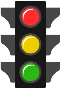
Green harbours an historical and deep-rooted association with safety and affirmation. When we see a green signal, it reassures us that the way is clear and that we can proceed safely. It represents progress and moving forward without impediment, making it a powerful symbol for safe and unobstructed progression. Red and green offer significant contrast, with the use of red to stop and green to go having been the case in modern society for decades, helping to make it a combination that we inherently understand.
The use of red and green for traffic lights actually stems from railway signage in the 1830s. Initially, the system used red as stop and white as go with, conversely, green meaning caution. However, this system was flawed, with drivers mistaking the white light for stars in the distance (or any other lights) with the corresponding results.
This scenario continued until the early 1900s when, as the story goes, the lens fell out of a red light causing a tragic collision and leading to the adoption of the more familiar system: red for stop, green for go and yellow/amber for caution.
In recent times, greater understanding of human’s visual sensitivity to colour has led to other changes such as those for emergency vehicles. Historically and typically painted red, most emergency vehicles now incorporate vivid yellow, green or white in their colouration.
While most of us recognise the use of green in emergency exit signage, it’s true that it’s not used everywhere. North America, for example, currently tends to use red (although this is changing). Most countries globally adhere to international standards and use green, either in text or as a background, based upon the design created by Yukio Ota in the 1970s (as seen in modern signage in the UK and signage legislation).
The International Standards Organisation is currently urging the European Commission to revise the relevant directive to establish Ota’s design as the definitive version and no longer permit variants. In fact, evidence suggests that a combination of nature and our visual acuity for green makes it more easily seen in smoky environments than is the case with many other colours.
Technically, this is associated with a phenomenon known as ‘scattering’ (ie the process by which light is deflected, refracted and absorbed by particles in the air). This changes the light’s direction, energy and even wavelength. Green scatters less than colours of shorter wavelengths, making it more conspicuous.
Not just coincidence
While it has not been possible to prove that all of the information conveyed here is behind green’s universal use in emergency exit signage, it seems much more likely than just being merely a coincidence.
What’s clear is that the reasoning (if only retrospectively) is sound. Green is easy for us to see. We can see it further away than any other colour, even in a smoky space. We like it. It makes us feel calm and safe and we’re drawn towards it.
Seems like a pretty good set of reasons to use green on a sign that’s vital in an emergency situation and could save lives. Similarly, red and green provide a stark contrast, increasing their respective visibility. We also have an intuitive understanding of their respective meanings resulting in a high ‘affordance’.
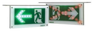
At Evaclite, we work diligently to apply this learning to our own solutions, ensuring that they’re quickly and easily seen and readily understood with high levels of affordance. The use of colour (ie green, red and white), contrast and motion, together with advanced luminance and printing techniques, has been employed to maximise products’ effectiveness.
Uniquely, the running man legend provides a consistent contrast ratio and an evenly illuminated and ‘witness free’ (no inconsistencies or significant variations in colour, tone or opacity to compromise clarity or visibility – see patent numbers GB2569053A/B,GB-2562171-B & US10297125) green and white legend that’s fully tested and compliant with legislation.
All of this goes towards ensuring that, in an emergency, Evaclite’s dynamic emergency exit signage is twice as easy to see, twice as quickly understood and has building occupants moving towards their nearest and safest exit in half the time (and every time). Evacuation signage does need to be green to be seen, but there’s a lot more to effective emergency signage than just that.
Alan Ward is Director at Evaclite (www.evaclite.com)


